
RideAlong
Group texts and improvised workarounds are how most parents manage carpool coordination — the result is fragmented, stressful, and hard to scale.
My Role
UX Researcher/Designer
Methods
Semi-structured interviews · Persona development · Scenario writing · Wireframing · Usability testing
Tools
Figma · Zoom · Notion
Can't wait to see it?
The Problem
Every parent who has managed a carpool knows the stress: Sunday night group texts, messages that get buried, last-minute scrambles, and the quiet resentment when one person always ends up doing more than their share. What looks like a minor logistics problem is actually a consistent source of cognitive load, social friction, and wasted time for families.
Our team wanted to understand this before designing anything. What we found in the research was richer than we expected and it shaped every design decision we made.
Research Questions
What are the most significant pain points parents experience when coordinating carpools?
What would a dedicated technology solution need to offer to meaningfully improve the experience?
What We Did
Phase 1 - Discovery Research
We conducted 10 semi-structured interviews with parents actively involved in carpool arrangements. I personally facilitated two of the sessions. Afterward, we clustered the data to surface recurring themes.
Six patterns came up consistently:
Communication overload
Group texts were the dominant tool, and they were failing. Messages got buried, confirmations were easy to miss, and no one had a real system.
Time cost
Parents reported spending 10-60 minutes per week on active coordination, on top of ongoing mental load.
Fragmented tools
Most were piecing together group texts, personal calendars, and spreadsheets. Nothing integrated with anything else.
Fairness concerns
Who drives how often was a recurring source of tension, usually unspoken. Parents wanted objective tracking without the awkward conversation.
Confirmation anxiety
Arrangements were made but rarely felt certain. Multiple follow-ups were common even after a ride was "confirmed."
Multi-schedule complexity
For parents managing more than one child across different activities, the coordination puzzle scaled quickly.
We developed four personas to anchor the design phase: Linda (multi-activity manager), Rick (reliability seeker), Michelle (overburdened coordinator), and Derek (schedule juggler).
Phase 2 - Conceptual Design
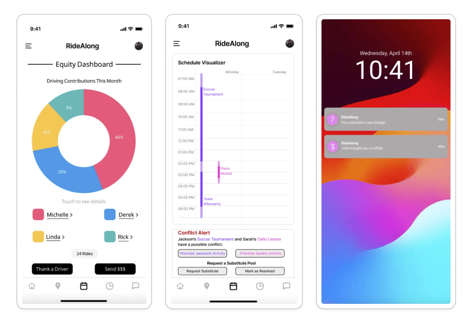
We prioritized two themes, fragmented tools and communication challenges, as the root problems that made everything else worse. From there, we defined four core features for RideAlong: a shared calendar with conflict detection, a focused in-app communication hub, accountability and reliability tools, and an equity management dashboard.
I wrote the design scenarios for this phase — one per persona, translating research findings into concrete use cases that showed how RideAlong would solve a specific problem for a specific person.
Phase 3 - Wireframing
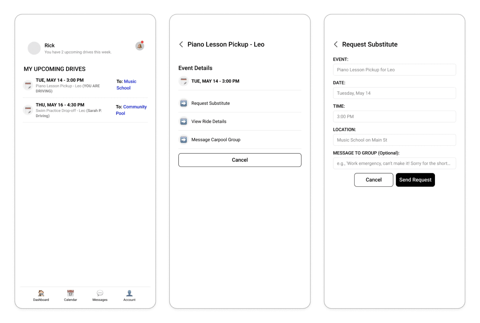
We each designed individual screens and consolidated them into two interaction flows. I designed six screens covering the communication and reliability flows: upcoming drives, event detail, substitute request form, calendar view, lock screen notification, and an appreciation feature.
Phase 4 - Usability Testing
We recruited five participants and each facilitated one session using the wireframe prototype. I facilitated the sessions and led synthesis across the team, writing the results summary and findings report for the final deliverable.
Key Findings
Participants picked up RideAlong's core concepts quickly. The equity dashboard stood out — "brilliant for avoiding awkward conversations" was how one participant described it. Task completion times generally fell within our 3-minute target.
Three issues came up consistently across sessions:
The path from the equity dashboard to messaging wasn't obvious; participants assumed they could tap a parent's name to start a conversation
The appreciation feature felt too rigid — participants wanted to input a specific dollar amount rather than choosing from preset options
Multiple participants flagged privacy concerns about how much of their driving history was visible to other parents
Design Changes
Testing surfaced five clear directions for the next iteration:
Conflict prioritization
Parents with multiple children needed a way to flag which activity takes priority when conflicts arise. The proposed solution was a priority checkbox at the time of scheduling, so the app knows which ride to escalate first without requiring the parent to manually sort through competing conflicts.
Contextual information
Participants wanted more logistical detail before committing to a ride: travel time, distance, estimated arrival, parent availability status, and vehicle information including car seat availability. Integrating with a device's maps app was identified as the most practical path to surfacing this automatically.
Equity dashboard gamification
The equity dashboard was well received, and participants wanted it to go further. Badges for Most Drives, Most Time in Car, and Most Kid Pickups were proposed as a way to make participation feel rewarding rather than just tracked.
Gesture support
Hand fatigue from repeated back-button taps came up in at least one session. Adding swipe-to-go-back and pinch-to-zoom on map interfaces would bring the app in line with standard mobile interaction patterns and reduce friction for frequent users.
Streamlined flows and auto-population
Several smaller issues pointed to the same underlying problem: too many steps between a conflict alert and its resolution. Making the conflict notification tappable and having it navigate directly to the schedule screen, combined with auto-populating the substitute request form from the conflict event, would significantly reduce the effort required at the moment when parents are most stressed.
Deliverables
The final deliverables included four research personas, four design scenarios, six wireframe screens across two interaction flows, and a usability test report covering results and redesign recommendations.
Reflection
RideAlong was my first experience working through the full arc of a user-centered design process — research, synthesis, conceptual design, wireframing, and testing all within one project.
A few things stuck with me:
The research doesn't lie, but it needs interpretation.
All six themes came from real participant voices. Deciding which two to prioritize still required judgment — weighing frequency, severity, and downstream impact. That process of synthesis and prioritization is something I keep developing.
Scenarios are underrated.
Writing them felt like a creative task, but it was analytically demanding. Each scenario had to be specific, grounded in verified persona needs, and concrete enough to demonstrate how a feature actually solves a problem. I started thinking of scenarios as a bridge between research and design.
Usability testing reveals what prototyping doesn't.
The homepage navigation issue where users expected to tap the conflict alert directly wasn't something any of us anticipated. It only became visible when real people used the prototype. That lesson became concrete in a way that no amount of design review could have achieved.
If I returned to this project, I'd run additional rounds of testing with the redesigned flows and expand the participant pool to include parents with less technology comfort to see how the equity and appreciation features land with a less digitally fluent user base.